


NotanIzer
4.330.00 Reviews
App Specs
- Version
- 1.2.2
- Updated On
- License
- $1.99
- Downloads
- 10,000+
- Developer
- bigpantsgroup
- Categories
- Art & Design
- Platform
- Android, iOS
Screenshots
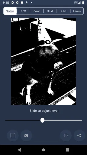
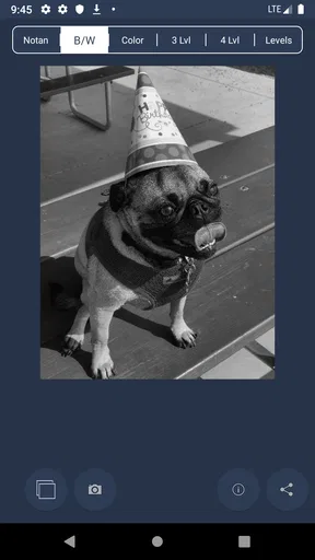
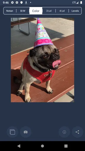
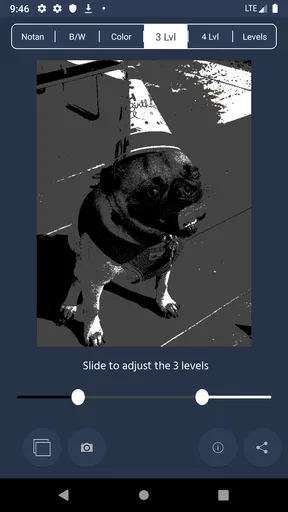
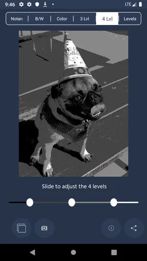
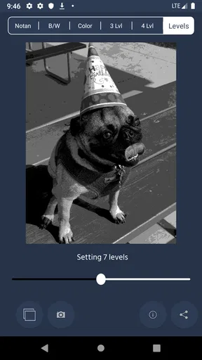
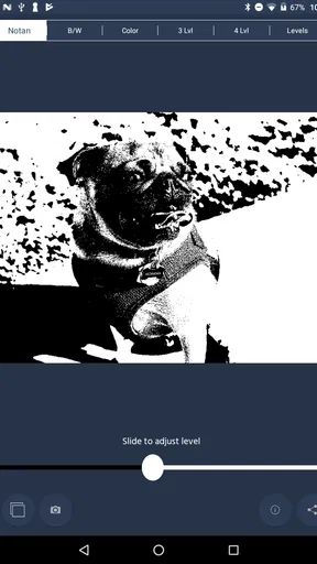
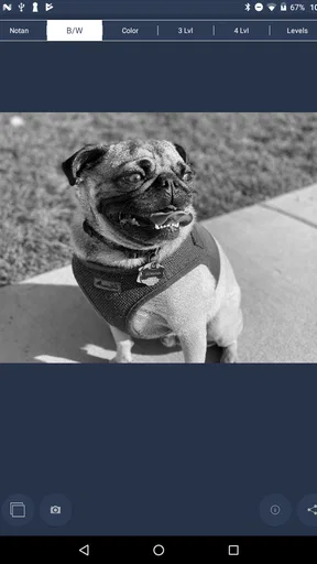
 Analysis by AppCompare
NotanIzer is the kind of small art app that makes sense once you understand the visual problem it is trying to solve. Its purpose is not to replace a full drawing studio or teach you how to paint. Instead, it gives you a focused way to think about an image through light and dark shapes. I found that change in viewpoint more useful than the short store summary suggests, especially when I wanted to check whether a composition worked before spending time on color, texture, or tiny details.
Published by bigpantsgroup, this paid Art & Design app costs $1.99 and is rated for Everyone. It has a 4.3 average from around 80 ratings, with over 10K installs, so it has found a modest but interested audience rather than trying to be an all-purpose creative platform. The current release is version 1.2.2, and it runs on Android 7.0 or later. Those details matter because this is best approached as a compact specialist tool: inexpensive, direct, and useful when its particular visual exercise matches what you are doing.
Where the first attempt can feel less obvious than expected
The main adjustment is mental. If you open NotanIzer expecting a normal drawing app with layers, brushes, color controls, and a large collection of editing tools, you may initially wonder where the rest of the workspace is. The app’s value comes from reducing an image to a stronger light-and-dark reading. That restraint is intentional, but it can feel like a limitation until you use it alongside another art workflow.
I would not begin with a complicated illustration. A simple photograph, a rough reference, or a basic composition is easier to judge. Look first for the largest masses: the subject, the background, a strong shadow, and any empty area that gives the image room to breathe. If you start by worrying about small edges, you miss the reason to use a notan study in the first place.
This is also where some users may think the result is “wrong” when it is actually revealing a weakness in the source image. A scene can look attractive in full color because of texture or atmosphere, yet become confusing when reduced to two value groups. That is useful feedback. The app is not necessarily failing to preserve the beauty of the reference; it may be showing that the composition depends too heavily on details that will disappear in a painting, logo, poster, or thumbnail.
My practical advice is to judge the result from a distance. Do not zoom in mentally on one interesting object. Ask whether the whole arrangement still reads when viewed quickly. A good study usually has a clear dominant shape and a sensible relationship between positive and negative space. If every area competes equally, the problem may be in the reference or in the way it was prepared, not in the tool itself.
Another early point of friction is expectation. This app is not a substitute for a photo editor, a vector package, or a full painting application. It is more like a visual checkpoint. I would use it before committing to a finished piece, not after I have already built a detailed artwork and expect it to perform a complete conversion workflow.
Worth Reading Before You Choose
EA SPORTS FC Mobile 26 Is a Bigger Football Game, but It Takes Time
Flipboard Shows What News Apps Must Do Beyond the Feed

Switching to Android Auto Means Rethinking Your Driving Routine

Google Calendar Makes a Crowded Week Easier to Manage

Ludo King Makes the Most of the Minutes Between Plans

Baby Panda World Brings Quick Play to Modern Phones, but Its Game Library Feels Busy
What to check before blaming the app
Before using a reference, choose one with clear separation between important forms. A low-contrast image, a busy background, or a subject hidden among similar tones can produce an unhelpful study. That does not make the app useless; it means the input is asking the tool to make a difficult decision. Try a simpler image first, then return to the harder one once you know what you want to inspect.
Lighting makes a noticeable difference. A portrait with even lighting may lose its facial structure when reduced, while a strongly lit object may become immediately readable. For landscapes, a horizon, a foreground silhouette, and one major middle-ground shape often provide a better starting point than a scene filled with scattered details. For design work, a rough arrangement of blocks can be more informative than a polished but visually noisy reference.
It is worth checking the basic device conditions as well. Because the app supports Android 7.0 and newer, an older compatible phone may still run it, but available screen space and general device responsiveness can affect how comfortable the process feels. If the display is small, keep the source simple and avoid judging tiny transitions. If the app appears slow, close other demanding apps and retry with a less complicated image before assuming that the artwork itself is the issue.
There is a useful setup habit here: decide what question you want answered before opening the image. Are you checking whether the subject is recognizable? Are you testing the balance of a poster? Are you trying to find a stronger silhouette? Each goal leads you to notice different things. Without a question, the two-tone result can become an abstract curiosity rather than a practical design decision.
The best preparation is not technical; it is choosing one visual question and one clear reference. That simple discipline prevents a lot of confusion. It also makes the app feel faster because you are not endlessly adjusting an image without knowing what improvement would look like.
Using the result as a planning tool
For painting, I would use the app at the thumbnail stage. Make several rough compositions, inspect their light-and-dark structure, and keep the one that reads most clearly. This can save time because a weak arrangement is difficult to rescue with attractive color. A notan check does not guarantee a successful painting, but it can expose an unbalanced layout before the expensive part of the process begins.
For photography, the same idea helps with cropping. A photograph may contain a strong subject but too much visual weight at one edge. Looking at its simplified structure makes it easier to notice whether the crop gives the subject enough space or whether a background shape is stealing attention. I would not treat the result as a final editing instruction, but it is a quick way to challenge your first impression.
For logos, icons, and poster concepts, the advantage is even more direct. If the identity of a design disappears when color is removed, it may rely on decoration rather than shape. Testing a concept in this way encourages stronger silhouettes and clearer spacing. The trade-off is that the app cannot replace a vector editor when you need precise curves, alignment, typography, export control, or production-ready files.
Students and beginners can also use it as a learning aid. Instead of copying every visible detail from a reference, they can study how a scene is organized into a few dominant masses. I found that this encourages better observation. You start asking why one shape should stay connected to another and whether a small dark mark is structurally important or merely texture.
Recovering when the workflow seems to go nowhere
If the first result is muddy, do not immediately keep making tiny changes. Start over with a more readable reference and compare the two. This gives you a baseline. If the clearer image behaves as expected, the original problem was probably contrast or composition. If both are difficult to interpret, revisit the setup and the way you are evaluating the result.
A useful recovery method is to simplify the source before asking for a final study. Remove distractions where possible, crop closer to the subject, and choose a frame with a stronger separation between foreground and background. Even when you intend to work from the original image, this temporary simplification can reveal which parts are carrying the composition and which parts are just noise.
Another practical trick is to work in stages. First, seek a broad arrangement that reads immediately. Then inspect one area that matters, such as the face in a portrait, the focal object in a still life, or the main lettering in a poster. If the whole image works but the focal area collapses, that is a more specific problem than saying the entire study failed. You can then adjust the reference or the original composition with a clear purpose.
Do not confuse a difficult reference with a broken session. A successful notan study is not always attractive on its own. Its job is to answer whether the structure is convincing. Sometimes an awkward result is the most valuable one because it stops you from polishing an arrangement that needs redesign.
If you are using an older device and the interaction feels unreliable, keep the test controlled. Reopen the app, reduce the number of other active tasks, and try a straightforward image. General device issues such as storage pressure, background activity, or an outdated system can affect many apps at once. It is sensible to separate those possibilities from a genuine problem with this particular tool.
The same applies to saved work and handoffs. I would treat the app as one stage in a broader process and keep important source material available elsewhere. That is not a criticism unique to NotanIzer; it is a sound habit whenever a small utility is being used to guide a larger creative project. Make the visual decision here, then continue the detailed work in the application designed for that next stage.
When another application is the better choice
If you need brushes, layers, masks, color correction, typography, or detailed retouching, a full drawing or photo-editing app is the better home. Those tools give you more control and are more suitable for finishing an illustration. Their disadvantage is that they can make it easy to spend an hour improving details before noticing that the composition is weak. NotanIzer is valuable precisely because it removes much of that distraction.
If your goal is professional vector output, choose a vector-focused application instead. A simplified visual study can help you decide whether a logo concept has a strong silhouette, but it does not replace the precision work needed to construct and deliver the logo. Likewise, if you want to create a finished black-and-white illustration, a dedicated drawing app will offer more expressive control over line, texture, and tonal variation.
There is also a case for skipping it if you rarely work with composition. Someone who only wants filters, quick social edits, or automatic photo enhancements may not gain much from a focused notan exercise. The $1.99 price is low, but the real cost is attention: you need to pause, interpret the result, and apply what you learn somewhere else. Users looking for instant decoration should choose a different kind of app.
On the other hand, artists who repeatedly begin with references, thumbnails, or rough layouts may find the narrow purpose refreshing. It creates a deliberate interruption before detail takes over. I especially like it for deciding between two arrangements that both look acceptable in color. The simplified view often makes the stronger option obvious.
How it fits into an everyday creative routine
Imagine preparing a small poster for a local event. You have a photograph, a title, and several blocks of information. In a normal editor, the colors and type choices can make the draft feel finished even when the hierarchy is unclear. I would use NotanIzer before finalizing the layout, checking whether the title, image, and empty space form a readable pattern. If the whole design turns into one dark rectangle, I would change the spacing or grouping before polishing the typography.
For a painter planning a weekend study, the routine could be even shorter. Choose a reference on the phone, inspect its dominant light and dark shapes, then make a quick thumbnail on paper or in a drawing app. The important insight is that NotanIzer does not need to be the place where the final artwork happens. Its strongest role is as a filter for decisions made before the final artwork.
A photographer might use it after a walk, not to rank every image, but to identify which frames have a clear visual anchor. A student could compare a reference with a first sketch and see whether the sketch preserved the original structure. A designer could test whether a mark remains recognizable without relying on color. These are different uses, but they all depend on the same habit: simplify first, then decide.
That workflow also explains why the app can be more useful than its compact presentation suggests. It encourages you to stop treating a reference as a collection of objects and start treating it as an arrangement of shapes. That is a small shift, but it affects composition, cropping, visual hierarchy, and the amount of detail you choose to keep.
A balanced look at the experience
I like the focus, the low purchase price, and the way the app supports decisions that are easy to postpone in a full creative suite. The 4.3 average suggests that many users find the concept worthwhile, and I can see why. When the source image is suitable, the result is quick to interpret and can prevent wasted work later.
The limitations are just as important. This is not a broad art toolbox, and its narrow approach will not suit everyone. A poor reference can lead to a poor study, and the app cannot magically understand which details matter to your intended artwork. You still need visual judgment. The reduced result may also feel too severe if your project depends on subtle tonal transitions rather than bold structure.
I would also avoid judging it as though it were a complete production environment. Its usefulness is measured by the quality of the decisions it helps you make, not by how many finishing controls it contains. If you want one app to take an image from reference to publication, this is not the efficient choice. If you want a dedicated checkpoint for light-and-dark composition, its restraint becomes the main advantage.
Because it is rated for Everyone, it is approachable for a wide range of users, including beginners who want a straightforward visual exercise. Still, simple access does not mean automatic understanding. New users get the most from it when they compare the result with a sketch, crop, or layout and then make a concrete change. Opening it repeatedly without applying those observations will make it feel less useful than it really is.
My practical verdict
NotanIzer is worth considering if you want a small, purpose-built way to test composition before investing in detail. I would recommend it to painters, photographers, students, illustrators, and designers who benefit from checking silhouettes, negative space, and visual hierarchy. The price makes experimentation easy, and the current version 1.2.2 keeps the app positioned as a compact utility rather than an oversized studio.
I would skip it if you are searching for a complete drawing package, advanced photo editor, or professional logo-production tool. Those alternatives are better when the task is to build, refine, and export finished work. This app earns its place beside them, not necessarily instead of them.
My advice is to begin with a clean, uncomplicated reference and one specific question. Use the result to make a crop, thumbnail, layout, or silhouette decision, then continue in the tool suited to the next step. When used that way, the simplicity feels deliberate rather than bare. It changes the way I look at a draft, and for a $1.99 Art & Design app, that is a convincing reason to keep it available.
Pros
- Turns photos into striking black-and-white images quickly.
- Simple controls make it accessible for beginners.
- Useful filters help create different tonal moods.
- Exports edited images for easy sharing.
- Works well for artistic portraits and minimalist scenes.
Cons
- Limited editing tools compared with full photo editors.
- Some effects may look harsh on detailed images.
- The interface can feel basic for advanced users.
- Results depend heavily on the original photo quality.
- Certain features may require in-app purchases or ads.
FAQs for NotanIzer
What is NotanIzer and what does it do?
NotanIzer is a creative image-editing app focused on transforming photos into notan-style artwork. It simplifies an image into contrasting light and dark areas, helping you study composition, balance, and visual rhythm. After testing its workflow, I found it especially useful for artists, students, photographers, and anyone who wants to create striking black-and-white designs without using complicated desktop software.
Is NotanIzer suitable for beginners?
Yes, NotanIzer is generally approachable for beginners because its main purpose is clear and its editing process is more focused than that of a full professional photo editor. You can start with a photo, adjust the tonal interpretation, and preview the result while experimenting. However, achieving a balanced notan may still require patience, particularly with detailed or poorly lit images.
Can I use my own photos in NotanIzer?
NotanIzer is designed around working with images, so users can typically begin with a photo from their device or capture one for editing, depending on the permissions and features available in the installed version. For the best results, choose an image with a recognizable subject, strong shapes, and clear lighting. Busy photos with weak contrast may need more adjustment.
Can I save or share artwork created with NotanIzer?
The app is intended to let users keep the results of their creative experiments, usually by saving an edited image to the device or sharing it through compatible apps. Available export options can vary according to the platform and version, so it is worth checking the permissions requested during setup. Before uninstalling the app, save important projects and exported images.
Is NotanIzer free to download, and does it contain ads or in-app purchases?
The download model, advertising, and premium features may differ between the Android and iOS versions and can also change with updates. Before installing, review the store listing for the current price, subscription details, advertisements, and in-app purchases. If you plan to use NotanIzer regularly for artwork or study, checking these conditions first will help avoid unexpected costs.


